Why are proper cartographic skills essential in working with UAS data?
It is easy to capture imagery of a location and call it a map, however for it to be useful it needs to be self-explantatory. When the viewer is able to determine scale, UAS data becomes substantially more useful.
What are the fundamentals of turning either a drawing or an aerial image into a map?
First, the image/drawing needs a reference scale. Next, a title must be added to the image. A description of symbols is necessary if they are present in the image.
What can spatial patterns of data tell the reader about UAS data?
Certain patterns in NDVI imagery can alert the reader to specific problems like: over-application of fertilizer, or pest infestations. It may be possible to identify the age of a neighborhood by analyzing thermal imagery and detecting patterns of relative heat loss. Also, spatial patterns visible in thermal imagery can be used to detect precious metals and other profitable minerals.
What are the objectives of the lab?
- To learn how to make good maps using UAS data.
- To learn how to understand spatial trends in UAS data.
Methods
Flash Flight Logs
In order to see how a flight path can be visualized in 3-D,we opened a KMZ file in Google Earth.
What components are missing that make this into a map?
It is missing a reference scale, and descriptive text.
What are the advantages and disadvantages of viewing this data in Google Earth?
It is easy for the viewer to ascertain the scale by seeing the flightpath in reference with identifiable features, such as houses and cars.
How do you save the Flight Path as a kml?
You press File-->Save-->then write the filename, and specify filetype .kml using the dropdown selection --> press 'Save'.
How do you import a kml into ArcMap?
A kml is imported using the "KML to Layer" tool in the Conversion toolbox.
Tlogs
How do you convert a Tlog into a KMZ?
In order to convert a Tlog into a kmz, first open 'Mission Planner' --> then click on 'Telemetry Logs --> press 'Tlog > Kml or Graph' --> once a new window opens, press 'Create KML + GPX'.
GEMs Geotiffs
What does calculating statistics allow you to do?
Calculating statistics allows you to analyze the reflectance characteristics, and provides more information for image classification and vegetation health assessment.
Pix4D Data Products
What is the difference between the DSM and the Orthomosaic?
The DSM is a raster showing the elevation of the highest surface throughout the surveyed area. Orthorectifying is a process where aerial photographs are corrected for topographic relief, so all pixels are directly over their real-world locations. This process completely removes perspective distortion from the resulting image. In short, the orthomosaic is a topographically correct aerial image, and the DSM is an elevation surface that was derived in the process of creating the orthomosaic.
What are the descriptive statistics for the DSMs? Why use them?
The DSM statistics tell the minimum, maximum, mean, and standard deviation of the surface's elevation values. This can be useful for quickly assessing change between two time periods, by merely noting if the values have changed (Table 1).

Why hillshade the DSMs?
Hillshading the DSMs allows for the surface features to be interpreted with much more ease.
What is needed to make an ArcScene image into a map?
In order to make an ArcScene image into a map, it needs: a sense of scale, some indication of direction, and a description of what the image is showing. Oblique image 1 has a grid with 20m spacing, giving the viewer a sense of scale. The Oblique reference map adds ancillary data, allowing for clearer interpretation of Oblique image 1.
 |
| Oblique Image 1: The Sivertson Mine. |
 |
| Oblique Reference Map |
Results
Flight Logs
What is the overall pattern of the flight logs?
The flight logs start and end at a specific point, and zig-zag across the study area, capturing pictures as they fly in swaths 26m apart (Figure 1).
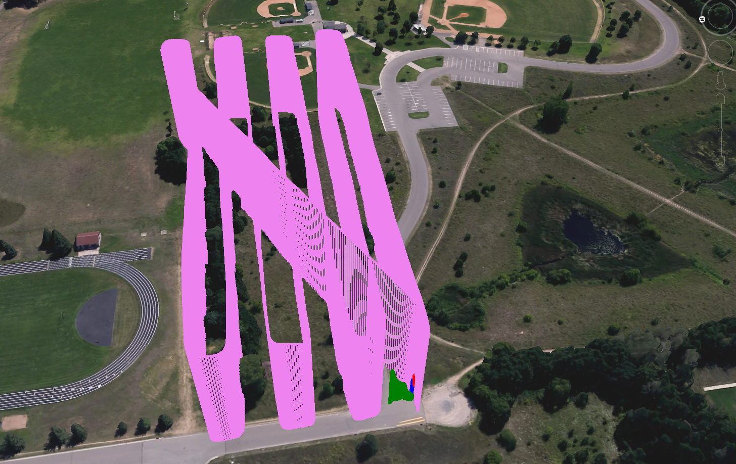 |
| Figure 1: A multirotor flight path. |
Do the flight logs appear to be from a multirotor or a fixed wing? What clues lead you to your decision?
The flight logs appear to be from a multirotor, as the turning radii are too sharp for a fixed wing to have been able to maintain lift (Figure 2).
 |
| Figure 2: The second multirotor flight path. Note the sharp turning radii. |
Geotiff
How does the RGB image differ from the base map imagery? What is the difference in zoom levels? How does this relate to GSD?
The RGB image was captured at a much higher resolution than the base map imagery. It was captured earlier in the morning, in the summer time, whereas the base map imagery was captured at just before noon in the early spring or late fall. The RGB image has higher resolution than the base map imagery, as its ground sampling distance is lower.
What discrepencies do you see in the mosaic? Do the images match seamlessly? Are the colors 'true'? Where do you see the most distortion?
The fence on the eastern edge of the community garden appears to shift 1.5m west, and I believe that is due to an error in the mosaic. The images do not match seamlessly. The images are RGB, but not true color, due to the sensor washing out whites. Distortion is most clearly seen over man-made, linear features (Figure 3).
 |
| Figure 3: A discrepancy in the georeferenced mosaic. |
Compare the RGB image to the NDVI mosaics. Explain the color schemes for each NDVI mosaic by relating this to the RGB image? Discuss the patterns on the image. Explain what an NDVI is and how this relates.
RGB shows an image captured with the three bands visible to the human eye. The NDVI images were created by comparing the visible reflectance values to the near-infrared reflectance values. The equation is NDVI = (NIR-VIS)/(NIR+VIS). NDVI FC1 uses red as an indication of where vegetation is located, and blue as an indication of where vegetation isn't. NDVI FC2 uses green as the indication of good vegetation health and red to indicate areas with low vegetation health. Areas with shadows are identified as being healthy vegetation, because they have higher NIR reflectance than visible reflectance.
 |
| Figure 4 |
Orthomosaic/DSM
What is the differeence between an orthomosaic and a geofereenced mosaic?
An orthomosaic is a mosaiced image created using z-values in the calculations. A georeferenced mosaic is just a number of georeferenced images that were mosaiced together.
What types of patterns do you notice on the orthmosaic and DSM. Describe the regions you created by combining differences in topography and vegetation.
Shadows on the orthomosaic indicate areas with high relief on the DSM. For Litchfield mine, I created regions for the: river, embankment, piles, and forest. For Sivertson Mine, I created regions for: berms, piles, the quarry wall, and the rest of the quarry area.


Conclusions
Summarize what makes UAS data useful as a tool to the cartographer and GIS user
UAS data allows for maps to be made using extremely temporally relevant and spatially relevant imagery. It also allows for analysis to be performed at high temporal scale, with high spatial accuracy.
What limitations does the data have? What should the user know about the data when working with it.
What limitations does the data have? What should the user know about the data when working with it.
The data are currently limited by the accuracy of the GPS and sensors, and by short flight times. The user should know that the data are only as accurate as the person who recorded the metadata and created the flight plan.
Speculate what other forms of data this data could be combined with to make it even more useful.
By combining UAS collected elevation data with hyperspectral imagery, it may be possible to perform mineral identification for mine sites. Creation of a 3D model from the classified imagery would allow for more precise volumetric calculations of both the desired material and the overburden.
No comments:
Post a Comment