Sunday, February 21, 2016

Processing Imagery with Pix4D

Introduction:

Pix4D is a software package that allows for automated bundle-block adjustment to be performed on UAS imagery. The software is extremely powerful, and can generate point clouds and orthomosaics from images, without the aid of a human technician.


The program is powerful, but needs data to be collected within certain parameters. When capturing any imagery, Pix4D needs at least 75% frontal overlap, and at least 60% side overlap for it to derive useful results. The necessary overlap percentages change depending on the surface. When capturing surfaces covered in sand or snow, Pix4D needs at least 85% frontal overlap and at least 70% side overlap.  When flying over fields, it requires the same overlap percentages as snow or sand, and also requires the flights to be done at lower altitudes, as it will increase the visual content.  Pix4D’s rapid check feature can be used to assess the quality of collected imagery in the field. When a study area requires multiple flights, it is important to ensure there is enough overlap between flight plans and that the images are captured with similar sun direction. For Pix4D to process oblique images, it is necessary for images to be captured first at a 45-degree angle and for additional images to be captured with increased flight heights and decreased angles. Ground Control Points (GCPs) are points within the area of interest with known coordinates. They increase the accuracy of Pix4D’s results by placing the model on its exact position on Earth’s surface. Once data are brought into Pix4D, the “Initial Processing” step can be performed. Initial processing generates a quality report, defining the accuracy criteria and average ground sampling distance of the project.

Methods:

I used Pix4D to process imagery captured with two different sensors, a Canon SX260 and the Sentek GEMs. The SX260 has built-in GPS, meaning it records the cameras spatial location in the metadata of each image as they are captured. The GEMs records the locational information in a slightly different manner, requiring the images to be processed using Sentek’s software in order to obtain the images locational information. In order to process the images, I first needed to create a new project, and specify the project’s file location.  Next, I added images to the project from their folder locations. When processing GEMs imagery, it is important not to accidentally include photos from both the visible spectrum and NIR spectrum, but rather process them individually. After the images have been selected, the next step is to make sure their geolocation information is correct and that the correct camera model is selected. As I said earlier, the SX260’s geolocation information is saved within each image, so the screen should show a green check mark next to the geolocation and orientation status. The GEMs requires its geolocation information to be imported from a spreadsheet before it can be processed. The GEMs sensor also requires its characteristics (focal length, sensor size) to be entered in manually before any processing can occur. After all of the parameters have been entered, the project is created.

After the projects were created, I performed initial processing to determine the quality of the collected imagery. The SX260 imagery consisted of 108 total images, of which 105 were used. The three removed images appear to have been captured as the UAS was ascending, leading to pixel distortion and less accurate geolocation (Figure 1). 
Figure 1: Images removed when processing the Canon SX260 flight

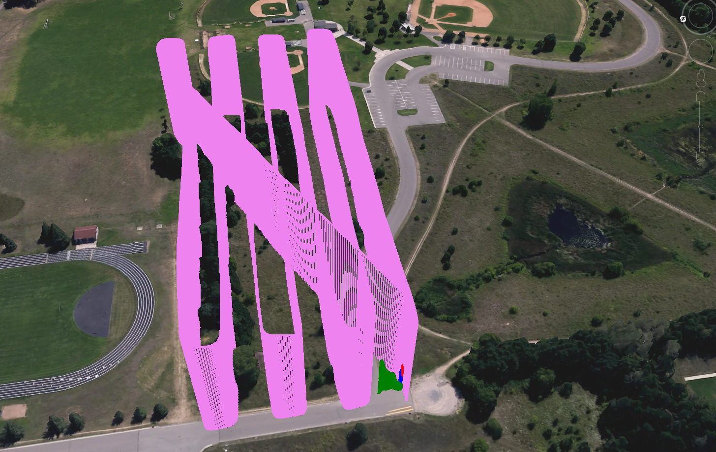
The areas between flight lines had slightly less overlap than where the UAS turned between flight lines (Figure 2). 
Figure 2: Number of overlapping images taken with the SX260 

The GEMs imagery consisted of 146 total images, of which 142 were used. The four removed images appear to have been captured over a line of trees with intense shadows…likely causing the software to have difficulty identifying matching pixels (Figure 3). 
Figure 3: Images removed when processing the GEMs flight.

The area covered by the removed images is where the flight plan has lowest overlap (Figure 4).
 
Figure 4: Number of overlapping images taken with the GEMs
After analyzing the quality report, I continued processing the data through the “Point Cloud Densification” and “DSM and Orthomosaic Generation” steps. Once the point clouds were generated it was possible to perform 2D and 3D calcuations from the point cloud as well as create a 3D fly-by animation (Figures 5,6). 
Figure 5: Calculating the total area of the community garden from the GEMs point cloud.

Figure 6: Calculating the volume of a shed at the community garden from the GEMs point cloud

Results:

The orthomosaics and DSMs were generated for the SX260 and GEMs at 1.44cm GSD and 2.62cm GSD, respectively. I measured a known distance (the 100 yard section of the running track) on the SX260 point cloud, in order to perform a basic assessment of spatial error. When measured, Pix4D measured the track’s length to be 100.68 meters or 110.104987 yards, 10% greater than its actual length (Figure 7).

Figure 7: When measured in Pix4D, the track is 100.68m long.

It is currently impossible for me to currently ascertain the spatial accuracy for other parts the imagery, as I don’t have any GCPs or other known distances. The DSM generated from the GEMs had elevation values 30 meters lower than the ground surface. This error is due to the internal GPS’s method of recording elevation not matching the parameter I set when entering the images into Pix4D. 

Overall, Pix4D generated fantastic results, far better than any mosaic generated from Sentek's GEMs software or Microsoft's Image Composite Editor. The SX260's orthomosaic and DSM were both generated at its 1.66cm GSD, and as such have extremely high detail (Figure 8). 

Figure 8: The Orthomosiac and DSM generated from the SX260
In spite of the vertical accuracy errors and larger GSD, the orthomosaic and DSM generated from the GEMs were also quite good (Figure 9). 
Figure 9: The orthomosaic and DSM generated from the GEMs


 Something to note when creating maps from incredibly high resolution imagery, such as the orthomosaic generated from the SX260, is that computers are always resampling the images to coarser resolutions except for at the smallest of scales. Resampling can cause certain details to appear unnecessarily pixelated, so it is important for the proper method to be specified. The "Natural Neighbors" interpolation method preserves pixel values, but causes linear features to appear jagged (Figures 10a, 11a). Bilinear Interpolation averages pixel values, which causes most features to appear smoother and more less distracting to the eye (Figures 10b, 11b).
Figure 10: a. This image was resampled using the Natural Neighbors method (left).
b. This image was resampled using Bilinear Interpolation (right).
Figure 11: a. This image was resampled using the Natural Neighbors method (left).
b. This image was resampled using Bilinear Interpolation (right).
Pix4D automates the photogrammetric process, allowing for relatively fast processing of UAS imagery, and does so rather well. The derivatives generated without GCPs appeared to be true to reality, and didn't feature any major distortion. The program has incredible capabilities, however, attention should still be paid to accuracy.


Saturday, February 13, 2016

Use of the GEMs Processing Software

Introduction:

The Sentek Geo-localization and Mosaicing Sensor (GEMS) is a VIS/NIR combination sensor that was designed for the generation of vegetation health indexes. It uses two cameras mounted side-by-side in order to capture the images simultaneously.

What does GEMs stand for? Geo-localization and Mosaicing System.

Look at figure 3 in the hardware manual and name what the GSD and pixel resolution are for the sensor. Why is that important for engaging in geospatial analysis. How does this compare to other sensors? The GEMS' GSD is 2.5cm @ 200 ft and the camera resolution is 1.3mp ~ (1280x1024). A Canon SX260 has a GSD of 2.06cm @ 200ft and the camera resolution is 12.1mp ~ (4256x2848).
How does the GEMs store its data. The data are stored on a USB storage device.
What should the user be concerned with when mounting the GEMs on the UAS? The sensor should be: maximally flat, away from magnets, in a vibration free location, and shielded from electromagnetic interference.
Examine Figures 17-19 in the hardware manual and relate that to mission planning. Why is this of concern in planning out missions? The sensor has an extremely narrow field of view, which requires many closely spaced flight lines are required to cover even an extremely small area.
Write down the parameters for flight planning software (page 25 of hardware manual). Compare those with other sensors such as the  Cannon SX260, Cannon S110, Nex 7, DJI phantom sensor, and Go Pro.


Camera
Sensor Resolution
Sensor Dimensions
Horizontal FOV (degrees)
Vertical FOV (degrees)
Focal Length
GEMS
1280 x 960 pixels
4.8x3.6mm
34.622
26.314
7.70mm
Canon SX260
4000 x 3000
6.30 x 4.72mm
69
54.5
4.5mm
Canon S110
4000 x 3000
7.60 x 5.70mm
73
58
5.2mm
Sony Nex7
6000 x 4000
23.6 x 15.7mm
67.4
47.9
18mm
DJI Phantom
4000 x 3000
6.30 x 4.72mm
81.7
66
3.6mm
GoPro
4000 x 3000
6.30 x 4.72mm
122.6
94.4
2.98mm

Software Manual:
Read the 1.1 Overview section. Then do a bit of online research and answer what the difference between orthomosaic and mosaic for imagery (orthorectified imagery vs. georeferenced imagery). Is Sentek making a false claim? Why or why not?  Sentek is making a false claim, as their imagery is not actually an orthomosaic. An orthomosaic is a collection of images that were all rectified into the same plane using their z values, so the distance between two points on the image is exactly the same as their ground distance. This allows for measurements to be recorded from the images. A georeferenced mosaic is a collection of images that were combined by matching pixel values with one another, and using their relative coordinates to assign their locations in the resulting image.

What forms of data are generated by the software? RGB, NIR, and NDVI imagery.
How is data structured and labeled following a GEMs flight? What is the label structure, and what do the different numbers represent? The data are structured by the time of the flight, with the first value being the "GPS week" the flight was conducted. The subsequent values represent the hours, minutes, and seconds of the GPS week at the moment the flight started.

What is the file extension of the file the user is looking to run in the folder? The user is looking for the '.bin' extension.
Part 2: Methods/Results

What is the basis of this naming scheme? Why do you suppose it is done this way? Is this a good method. Provide a critique. This naming scheme is based on the time the flight began. This is done so no folders have the same names. The only negative of this naming convention, is that it is difficult to interpret the meaning of the folders unless the names are converted to local time.
Explain how the vegetation relates to the FC1 colors and to the FC2 colors. Which makes more sense to you? Now look at the Mono and compare that to the vegetation. The areas with high NDVI values have higher reflectance values in the NIR spectrum than in the visible spectrum. Areas with lush vegetation have higher NIR reflectance and are shown as having higher NDVI values than areas of drier vegetation. Areas with high NDVI values in FC1 are shown in red, and low values are shown in blue. Areas with high NDVI values in FC2 are shown in green, and low values are shown in red. The color ramp used by FC2 makes more logical sense than the color ramp used by FC1, as people are more likely to associate green with healthy vegetation, and red with unhealthy vegetation.
Now go to section 4.5.5 and list what the two types of mosaics are. Do these produce orthorectified imagesWhy or why not? The two mosaic types are 'Fast' and 'Fine'. Neither method produces orthorectified images, because they don't take the images elevations into account.
Generate Mosaics. Be sure to check all the boxes so you compute NDVI, use the default color map, perform fine alignment. Make sure you uncheck use GPU acceleration. Describe the quality of the mosaic. Where are there problems. Compare the speed with the quality and think of how this could be used. The mosaic generation is a relatively quick process, but its results are less than stellar. There are some errors where linear features show discontinuity, but the quality is good for the fast processing time.
Navigate to the Export to Pix4D section. What does it mean to export to Pix4D? Run this operation and look at the file. What are the numbers in the file used for? (Hint: you will use this later when we use Pix4D) The Export to Pix4D operation creates a '.csv' file which holds the coordinate information for all of the images, which will be used when processing the imagery in Pix4D.
Go to section 9.6 on Geo-tif. What is a geotif, and how can it be used? A geotiff is a geo-referenced mosaic, and can be easily added to any GIS tool for additional processing or display.
Go into the Tiles folder and examine the imagery. How are the geotifs different than the jpegs? The geotiffs have their coordinate data saved within their files, which allows for their easy display in GIS software.
Now open Microsoft Ice and generate a mosaic for each set of images. What is the quality of the product compared to GEMs. Does this produce a Geotif? Where might Microsoft ice be useful in examining UAS data? Microsoft Ice generated a visually pleasing mosaic at a much higher quality than the GEMs mosaic. However, the program crashed before I could save the output, so it wasn't really useful in the end.
Part 3: Make some maps
Figure 1: RGB Imagery
Use what you learned from last week to describe patterns on each map.
The RGB images show distinctive differences in lighting in the mosaiced images, specifically where flight lines overlap. This is seen as vertical striping down across the images (Figure 1).

Figure 2: NIR Imagery
The NIR images show substantially less contrast and detail in highly shadowed areas. These areas are the same striped areas visible in the RGB imagery (Figure 2).

Figure 3: Mono NDVI Imagery
The Mono NDVI images have values that seem to have been skewed by the shadowed regions of the NIR imagery, as those regions have relatively lower reflectance values than other regions of the images (Figure 3). 

Figure 4: NDVI FC1 Imagery
The NDVI FC1 images further exaggerate the negative emphasis the shadowed regions of the images had on the overall output NDVI values. The shadows completely eliminated the scale from the NDVI calculations, 

Figure 5: NDVI FC2 Imagery
The NDVI FC2 images show healthy vegetation in green and unhealthy vegetation and other objects in red. The shadowing of the NIR images, again ruined the scale of the pond imagery, showing similar vegetation as having completely different values.

Part 4: Conclusions

The GEMs software and sensor seem like wonderful equipment, however, in practice the results are underwhelming. The software can produce a mosaiced image incredibly quckly, something of high value in the field, however, it sacrifices quality for speed. 

The sensor itself has a narrow field of view, a quality that reduces the distortion in its captured images. The narrow field of view is a double-edged sword, and requires more flight lines to cover the same area as a camera with a wider field of view.

The GEMs system seems like a wonderful idea, but becomes limited by certain hiccups. Although it shoots VIS and NIR imagery simultaneously, the images are kept seperate, rather than combined into a multiband image. This limits their usability, and limits the capabilities of Pix4D's photogrammetry algorithms. The sensor's small field of view and tiny sensor both combine to make it an incredibly cumbersome sensor to fly, as it requires incredibly longer flight times when compared to other sensors. The fact that its weight is comparable to the other - higher resolution sensors, and that it costs substantially more than the other sensors both speak against its use.

Friday, February 5, 2016

Constructing Maps with UAS Data

Introduction

Why are proper cartographic skills essential in working with UAS data?
It is easy to capture imagery of a location and call it a map, however for it to be useful it needs to be self-explantatory. When the viewer is able to determine scale, UAS data becomes substantially more useful.

What are the fundamentals of turning either a drawing or an aerial image into a map?
First, the image/drawing needs a reference scale. Next, a title must be added to the image. A description of symbols is necessary if they are present in the image.

What can spatial patterns of data tell the reader about UAS data?
Certain patterns in NDVI imagery can alert the reader to specific problems like: over-application of fertilizer, or pest infestations. It may be possible to identify the age of a neighborhood by analyzing thermal imagery and detecting patterns of relative heat loss. Also, spatial patterns visible in thermal imagery can be used to detect precious metals and other profitable minerals.

What are the objectives of the lab?
- To learn how to make good maps using UAS data.
- To learn how to understand spatial trends in UAS data.


Methods

Flash Flight Logs

In order to see how a flight path can be visualized in 3-D,we opened a KMZ file in Google Earth.

What components are missing that make this into a map?
It is missing a reference scale, and descriptive text.

What are the advantages and disadvantages of viewing this data in Google Earth?
It is easy for the viewer to ascertain the scale by seeing the flightpath in reference with identifiable features, such as houses and cars.

How do you save the Flight Path as a kml?
You press File-->Save-->then write the filename, and specify filetype .kml using the dropdown selection --> press 'Save'.

How do you import a kml into ArcMap?
A kml is imported using the "KML to Layer" tool in the Conversion toolbox.

Tlogs

How do you convert a Tlog into a KMZ?
In order to convert a Tlog into a kmz, first open 'Mission Planner' --> then click on 'Telemetry Logs --> press 'Tlog > Kml or Graph' --> once a new window opens, press 'Create KML + GPX'.

GEMs Geotiffs

What does calculating statistics allow you to do?
Calculating statistics allows you to analyze the reflectance characteristics, and provides more information for image classification and vegetation health assessment.

Pix4D Data Products

What is the difference between the DSM and the Orthomosaic?
The DSM is a raster showing the elevation of the highest surface throughout the surveyed area. Orthorectifying is a process where aerial photographs are corrected for topographic relief, so all pixels are directly over their real-world locations. This process completely removes perspective distortion from the resulting image. In short, the orthomosaic is a topographically correct aerial image, and the DSM is an elevation surface that was derived in the process of creating the orthomosaic.

What are the descriptive statistics for the DSMs? Why use them?
The DSM statistics tell the minimum, maximum, mean, and standard deviation of the surface's elevation values. This can be useful for quickly assessing change between two time periods, by merely noting if the values have changed (Table 1).


Why hillshade the DSMs?
Hillshading the DSMs allows for the surface features to be interpreted with much more ease.

What is needed to make an ArcScene image into a map?
In order to make an ArcScene image into a map, it needs: a sense of scale, some indication of direction, and a description of what the image is showing. Oblique image 1 has a grid with 20m spacing, giving the viewer a sense of scale. The Oblique reference map adds ancillary data, allowing for clearer interpretation of Oblique image 1.
Oblique Image 1: The Sivertson Mine.

Oblique Reference Map


Results

Flight Logs

What is the overall pattern of the flight logs?
The flight logs start and end at a specific point, and zig-zag across the study area, capturing pictures as they fly in swaths 26m apart (Figure 1).
Figure 1: A multirotor flight path.

Do the flight logs appear to be from a multirotor or a fixed wing? What clues lead you to your decision?
The flight logs appear to be from a multirotor, as the turning radii are too sharp for a fixed wing to have been able to maintain lift (Figure 2).

Figure 2: The second multirotor flight path.
Note the sharp turning radii.


Geotiff

How does the RGB image differ from the base map imagery? What is the difference in zoom levels? How does this relate to GSD?
The RGB image was captured at a much higher resolution than the base map imagery. It was captured earlier in the morning, in the summer time, whereas the base map imagery was captured at just before noon in the early spring or late fall. The RGB image has higher resolution than the base map imagery, as its ground sampling distance is lower.

What discrepencies do you see in the mosaic? Do the images match seamlessly? Are the colors 'true'? Where do you see the most distortion?
The fence on the eastern edge of the community garden appears to shift 1.5m west, and I believe that is due to an error in the mosaic. The images do not match seamlessly. The images are RGB, but not true color, due to the sensor washing out whites. Distortion is most clearly seen over man-made, linear features (Figure 3).

Figure 3: A discrepancy in the georeferenced mosaic.

Compare the RGB image to the NDVI mosaics. Explain the color schemes for each NDVI mosaic by relating this to the RGB image? Discuss the patterns on the image. Explain what an NDVI is and how this relates.
RGB shows an image captured with the three bands visible to the human eye. The NDVI images were created by comparing the visible reflectance values to the near-infrared reflectance values. The equation is NDVI = (NIR-VIS)/(NIR+VIS). NDVI FC1 uses red as an indication of where vegetation is located, and blue as an indication of where vegetation isn't. NDVI FC2 uses green as the indication of good vegetation health and red to indicate areas with low vegetation health. Areas with shadows are identified as being healthy vegetation, because they have higher NIR reflectance than visible reflectance.
Figure 4


Orthomosaic/DSM

What is the differeence between an orthomosaic and a geofereenced mosaic?
An orthomosaic is a mosaiced image created using z-values in the calculations. A georeferenced mosaic is just a number of georeferenced images that were mosaiced together.

What types of patterns do you notice on the orthmosaic and DSM. Describe the regions you created by combining differences in topography and vegetation.
Shadows on the orthomosaic indicate areas with high relief on the DSM. For Litchfield mine, I created regions for the: river, embankment, piles, and forest. For Sivertson Mine, I created regions for: berms, piles, the quarry wall, and the rest of the quarry area.


Conclusions

Summarize what makes UAS data useful as a tool to the cartographer and GIS user
UAS data allows for maps to be made using extremely temporally relevant and spatially relevant imagery. It also allows for analysis to be performed at high temporal scale, with high spatial accuracy.

What limitations does the data have? What should the user know about the data when working with it.
The data are currently limited by the accuracy of the GPS and sensors, and by short flight times. The user should know that the data are only as accurate as the person who recorded the metadata and created the flight plan.


Speculate what other forms of data this data could be combined with to make it even more useful.

By combining UAS collected elevation data with hyperspectral imagery, it may be possible to perform mineral identification for mine sites. Creation of a 3D model from the classified imagery would allow for more precise volumetric calculations of both the desired material and the overburden.